Maternal Mental Health Alliance
A website redesigned to feel as human as the support it offers.
At a glance
increase in overall engagement rate
increase in resources page views
increase in event interactions
The challenge
The Maternal Mental Health Alliance advocates for perinatal mental health support, and has helped secure millions in NHS funding across the UK for maternal mental health services - work that depends on being taken seriously by funders, trusted by beneficiaries, and found by the people who need it most.
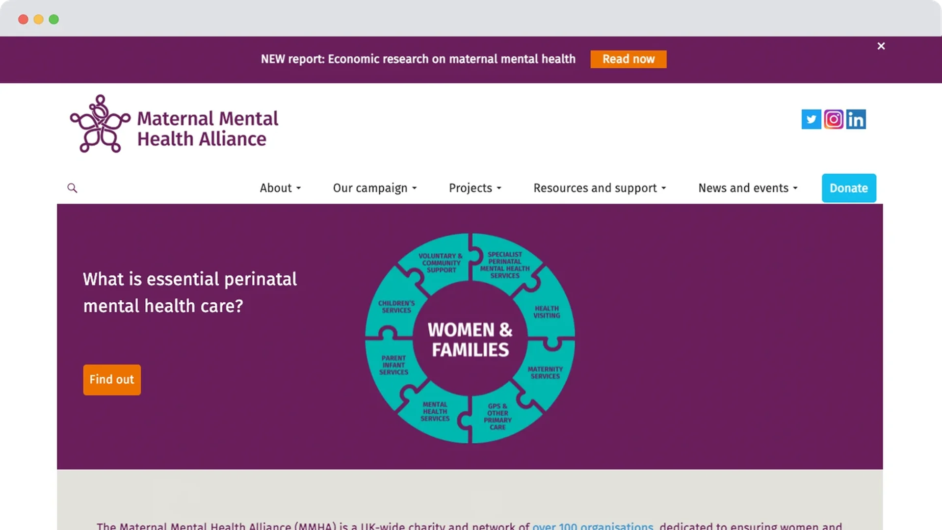
The charity's old website was working against all three. Content was structured around how MMHA organised itself internally rather than what a visitor actually needed to find, the donation journey wasn't set up to convert, and the design read as corporate - at odds with the warmth and support the charity actually provides. New members, funders, and people with lived experience were all struggling to connect with a site that didn't reflect any of them.
Before
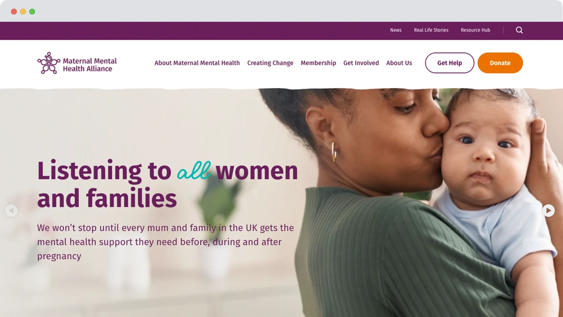
After
The solution
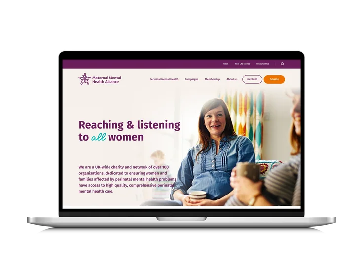
We rebuilt the website around what a visitor actually needed to find, rather than how MMHA was organised internally - content restructured for clarity, and workflows improved on MMHA's side too, so the team could manage it more easily going forward.
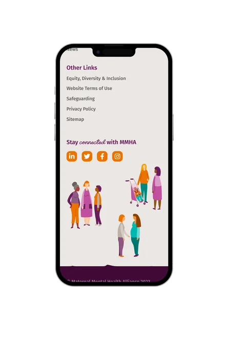
Real beneficiary stories now sit front and centre, replacing the more corporate, distant feel of the old site - a shift that matters most for funders and new members deciding whether to get involved, since a lived experience is more persuasive than a mission statement. A softer typeface, a more human illustration style, and a warmer approach to imagery carried that same shift through the entire visual experience.
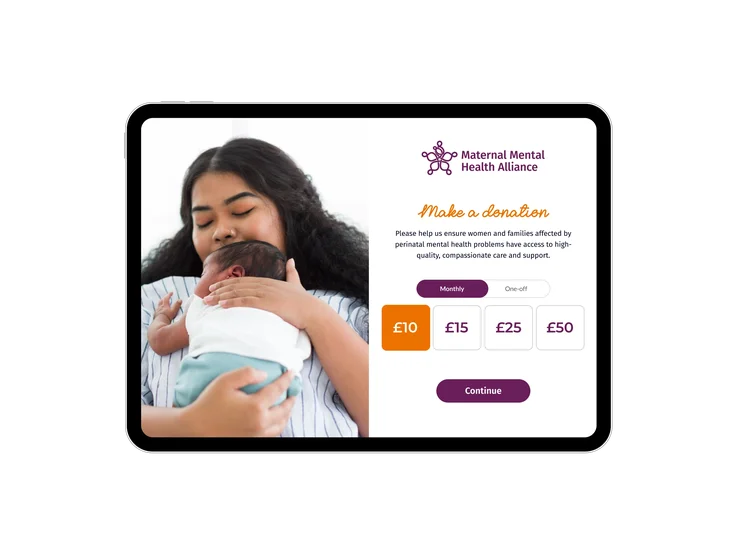
Underneath all of this, MMHA moved onto Giant Giving, our own donation platform, turning a donation journey that wasn't converting into one built specifically to.
The impact
More people are finding their way to what MMHA actually offers. Resources page views rose 128%, and event interactions jumped 314% - visitors aren't just arriving, they're exploring the support, information, and opportunities to get involved that the old site made hard to find.
Engagement overall is up 144%, with engaged sessions rising 15% on top of that - a site that finally holds people's attention rather than losing them to a confusing structure or a tone that didn't invite them in.
For a charity whose work depends on funders, members, and people with lived experience choosing to engage, that shift matters as much as any single number. A warmer, clearer website hasn't just changed how MMHA looks, it's changed how many people are willing to stay and take the next step.


Make people feel welcome enough to stay
Let's build a website that reflects the warmth behind your work, not just the mission statement.