Perennial
A digital transformation to empower horticultural professionals
The challenge
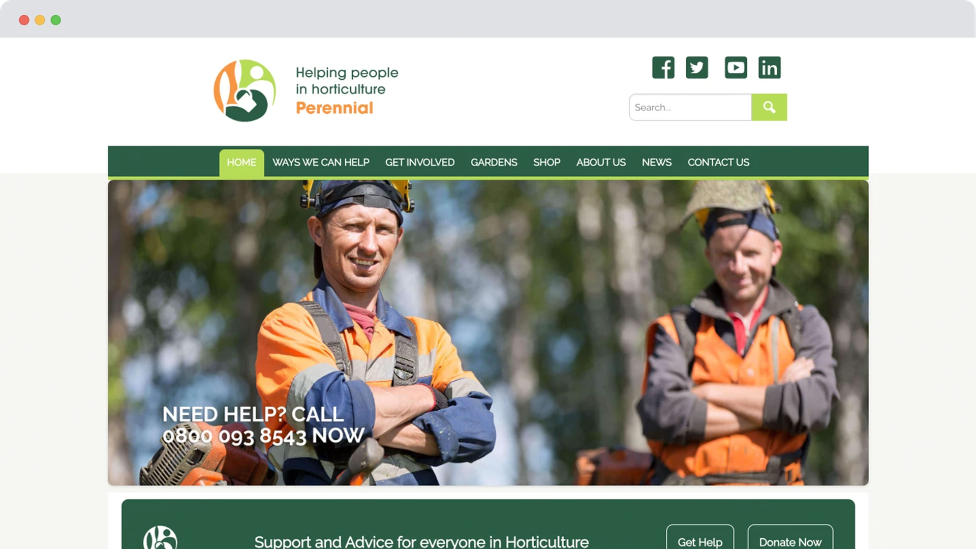
A website that no longer met Perennial’s needs.
As the only UK charity dedicated to supporting people in horticulture, Perennial plays a vital role in offering financial, emotional, and practical assistance to thousands of professionals and retirees each year.
However, as digital engagement became increasingly critical, Perennial faced a major challenge - its existing website lacked the flexibility and functionality needed to:
- Deliver tailored content to multiple audiences
- Empower the team to manage and update the site with ease
- Support the charity’s ambitious new digital strategy
Working alongside Productle, Perennial developed a comprehensive digital roadmap, which identified the urgent need for a new, future-proofed website. That’s where Giant Digital came in, to design and build a leading platform that would serve the charity for years to come.
The opportunity
A digital destination for Perennial’s community.
Perennial serves a wide range of audiences, from horticultural professionals in need of support to the garden-loving public who help fund the charity’s work.
The new website needed to:
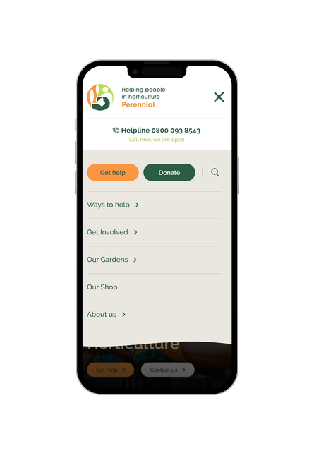
- Simplify navigation to help each audience quickly find relevant information
- Enhance content accessibility for a more inclusive experience
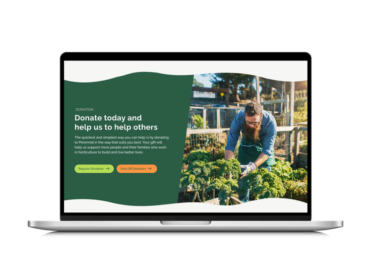
- Support online donations to sustain Perennial’s vital services
- Embed Perennial’s brand identity to create a stronger digital presence
Through in-depth discovery sessions, user research, and strategic planning, we built a scalable, high-performing website that delivers on all fronts.
The solution
A digital platform rooted in accessibility and engagement.
1. A more inclusive and accessible experience
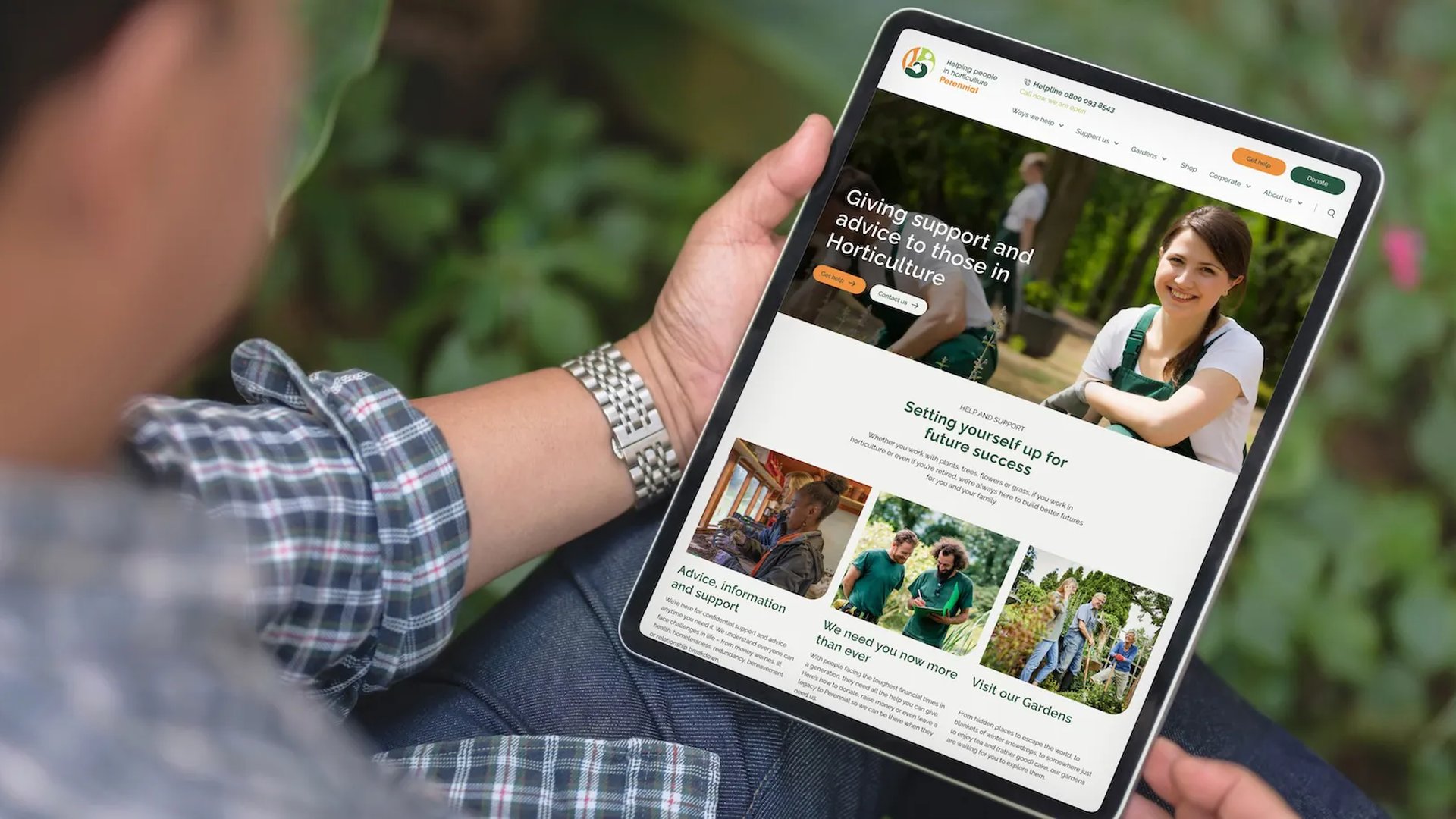
With nine distinct audience groups, we prioritised accessibility and inclusivity in the site’s design and functionality.
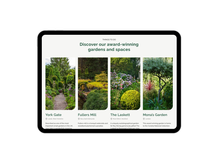
- Updated imagery to better reflect the diverse communities Perennial supports
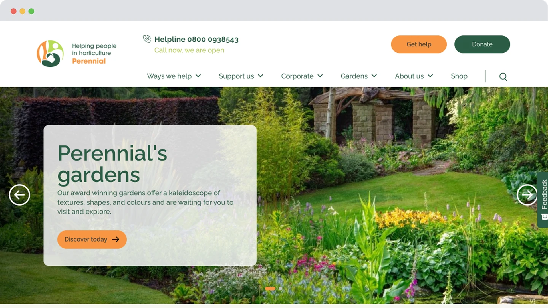
- A modern, welcoming design infused with Perennial’s brand identity
- Reworked content structure to improve navigation and ease of use
- Stronger storytelling elements to make key content (like financial advice) more engaging and digestible
2. A smarter, more manageable website
One of the biggest challenges Perennial faced was website administration - updates were slow, difficult, and frustrating for the team.
To fix this, we:
- Built the platform with flexibility in mind, ensuring the Perennial team could easily update content
- Implemented a more intuitive content management system (CMS), allowing for seamless content creation and organisation
- Created a clearer user journey, ensuring visitors quickly find the support, resources, and donation opportunities they need
3. A platform that supports growth and fundraising
Perennial doesn’t just provide support, it also needs sustained donations to fund its work.
To help boost engagement and fundraising, we:
- Optimised the donation journey, ensuring a frictionless giving experience
- Improved key visitor engagement, particularly within the Home & Garden section, which helps drive fundraising opportunities
The impact
A website that works for Perennial's mission.
The new platform is not just an immediate improvement, it’s a scalable, future-proofed solution that will support Perennial’s mission for years to come.
increase in key visitor interest (Home & Garden section)
increase in average engagement time
increase in engaged sessions

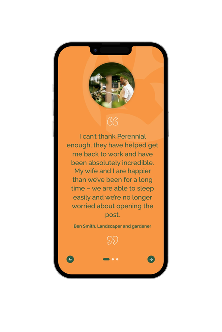
"Working with Perennial on their new website was a rewarding experience. We aimed to create a digital platform that not only meets the diverse needs of their audiences but also embodies their mission of support and inclusivity. The project allowed us to bring innovate design elements and enhanced storytelling to the forefront, ensuring the site is engaging and accessible for all users."
Gaby Frylinck, Product Designer (Creative) at Giant Digital
A future-ready digital strategy for Perennial
Founded in 1839, Perennial has been a lifeline for horticultural professionals for 185 years. With its new digital platform, the charity is now better equipped than ever to:
- Support those in need through accessible, engaging content
- Educate and raise awareness about the challenges facing horticultural professionals
- Increase donations to sustain its vital services
- Continue evolving its digital strategy with a flexible, adaptable website
With special thanks
to the fantastic team at Perennial for your dedication and collaboration. It’s been a pleasure to support the important work you do for people in horticulture.
and to our Giant team...
Ben Armstead
Cael O'Sullivan
Eugenia Soroet
Gaby Frylinck
Jake Quirke
Kelly Appleby
Lalita D'Cruze
Matt Buck
Peter Smith-Keary
Rob Tagg
Toby Lees
Wayne Fagan
Discover more of our work
Looking for a website that grows with your mission?
We can help you strengthen engagement, streamline fundraising and put your audience first. Let’s chat.
Get in touch today