Whizz Kidz
A digital platform that moves with its users.
The challenge
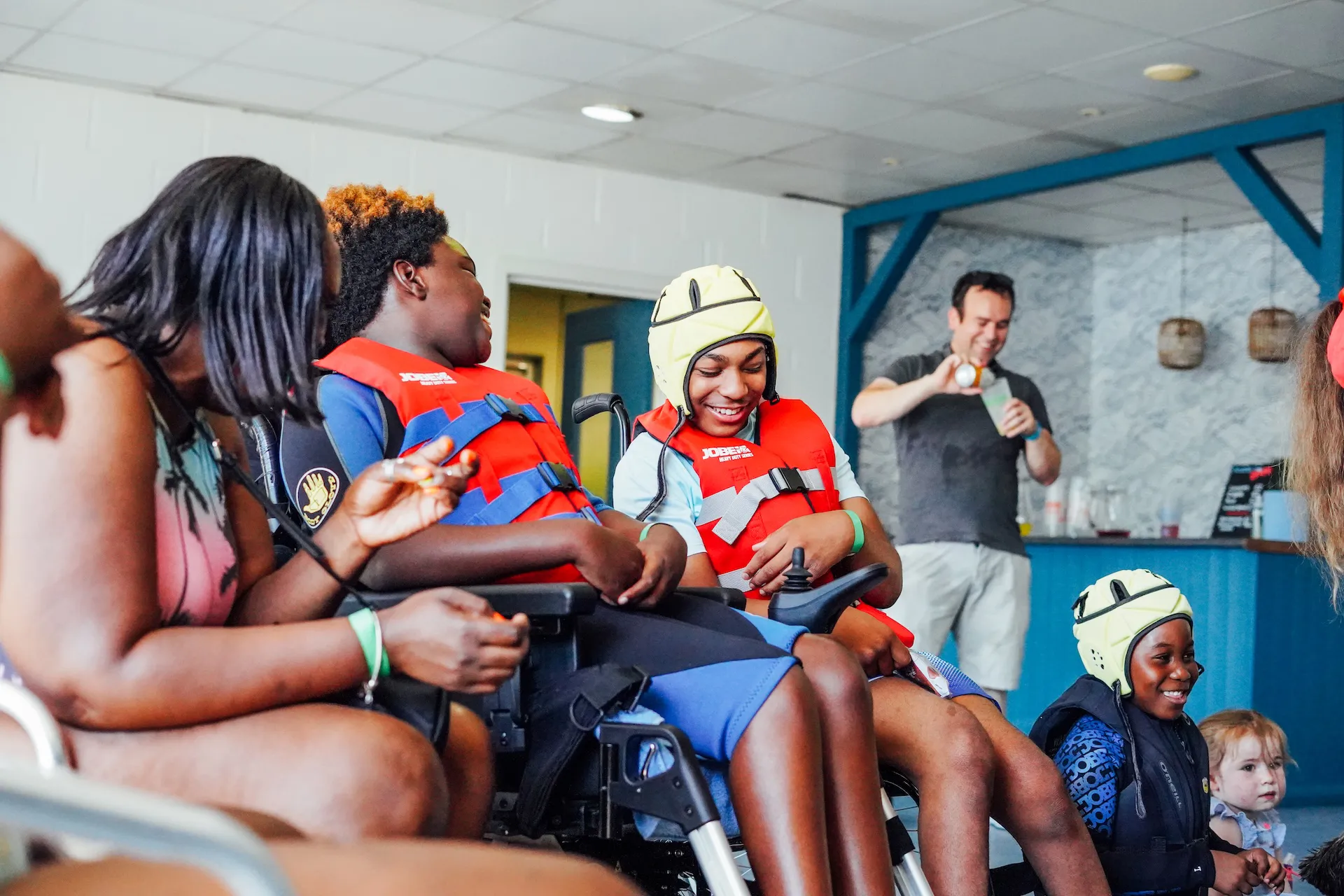
Whizz Kidz helps young wheelchair users get access to the mobility equipment they need, backed by a new strategy focused on reaching more of the families who could benefit from it. The charity had just been through a full rebrand - a bold new identity that its website needed to properly live up to.
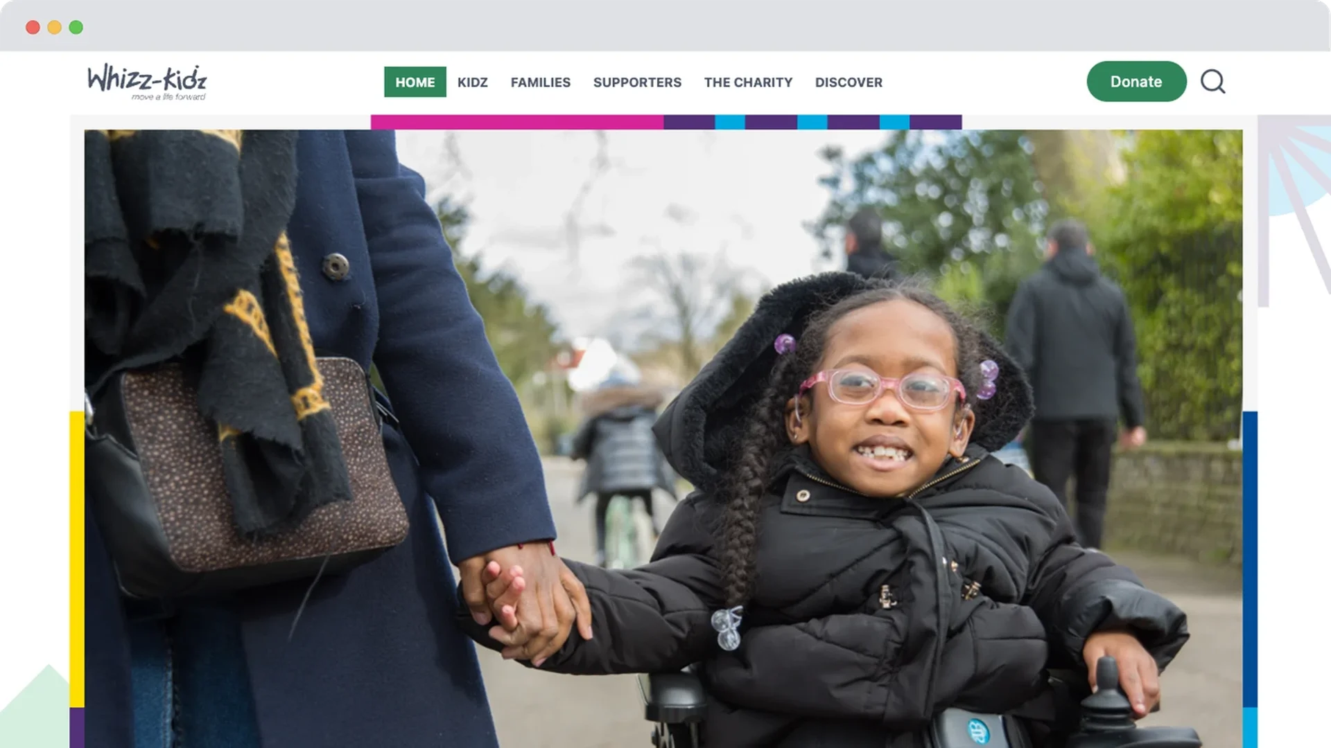
The old site wasn't built for any of that. Navigation was hard work, content wasn't structured to be found by the people searching for it, and the experience didn't reflect the confidence of the brand behind it - all while accessibility, something central to who Whizz Kidz serves, hadn't been designed in from the start. With a bolder strategy and a bolder brand already in motion, sticking with the existing site simply wasn't an option.
Before
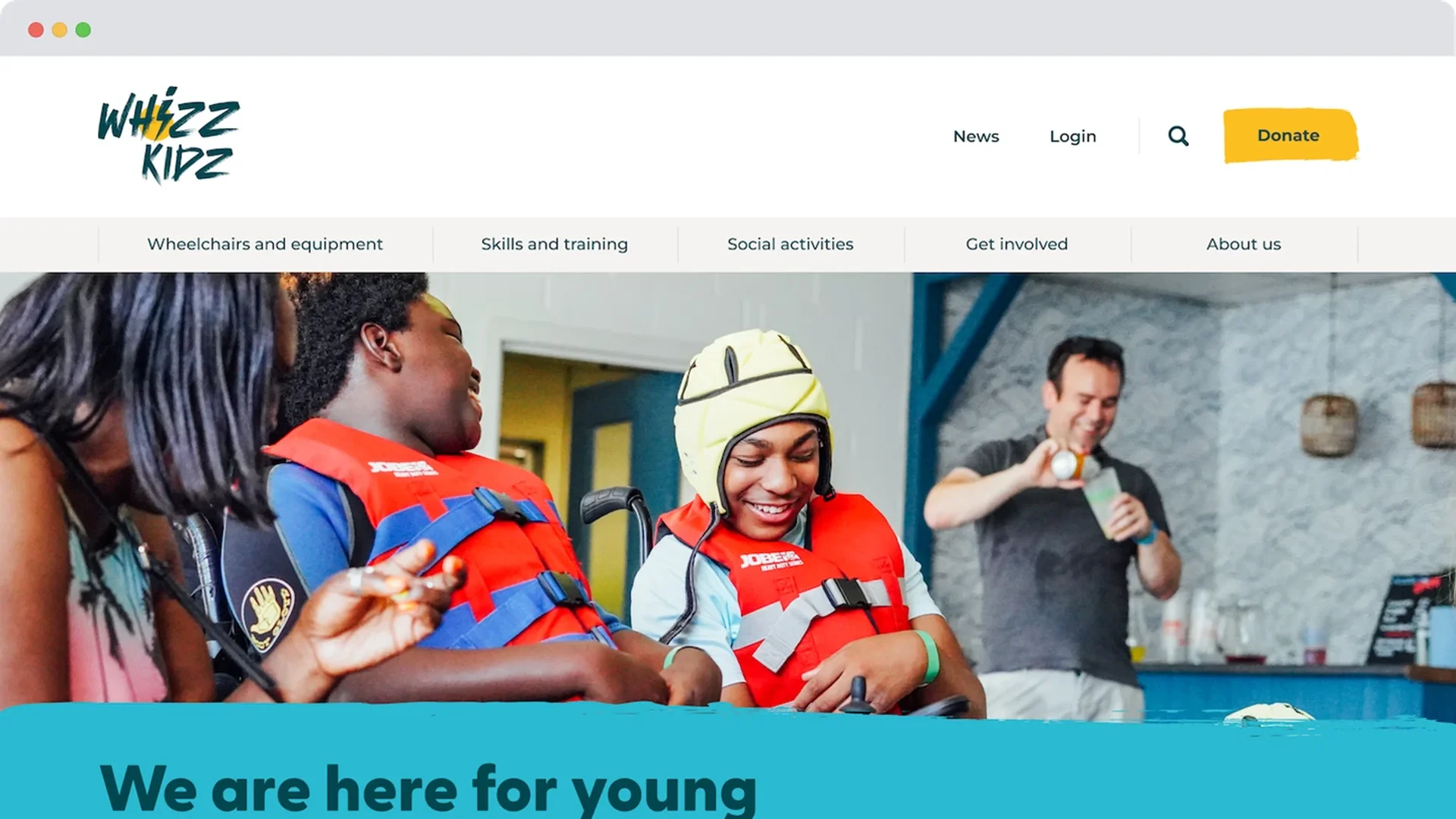
After
The solution
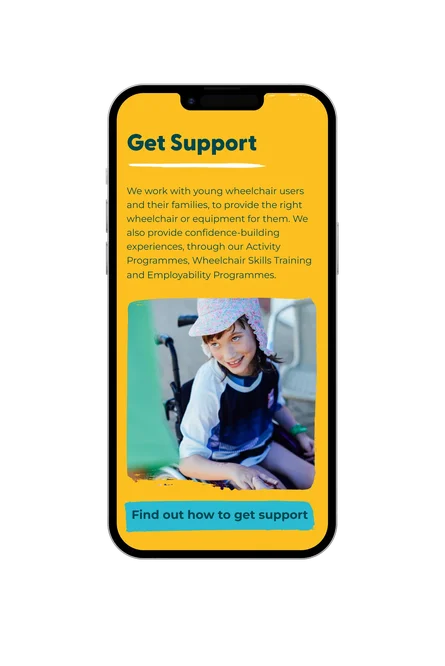
The Youth Board - a group of young wheelchair users consulted throughout the project - shaped decisions that would otherwise have been guesswork: what content to prioritise, how information should be laid out, what actually made the site easier or harder to use. Their input ran through the whole build, not just a single accessibility review at the end.
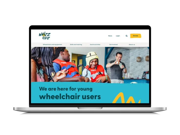
The new brand identity was translated into a website that's visually confident without compromising accessibility - proving the two don't have to be a trade-off. Navigation was restructured from the ground up, so beneficiaries, funders, and supporters can each find what they need quickly, rather than working through a single generic path built for no one in particular.
Underneath the visible experience, the site's code and structure were optimised for speed - faster load times and smoother navigation that matter as much as anything visible on the surface, especially for users relying on assistive technology that can make a slow, clunky site far harder to use than it looks.
The impact
Fewer people are leaving the moment they arrive. Bounce rate fell from 75% to 54% - a significant shift for a charity whose whole strategy depends on people staying long enough to find the support, the funding routes, or the story that brought them there in the first place.
Those who stay are spending more time engaging with what they find, with time on site up 19.4% since launch. Feedback since has echoed the same thing directly: visitors describing the site as easier to navigate, with the information they need actually easy to find.
For a charity mid-rebrand, that combination - a bolder identity landing well, backed by a website that finally makes it easy to act on - is exactly what the project set out to prove.

Giant took the time to understand our new brand, our different audiences and our technical requirements. They were happy to spend the time required during the discovery, specification and design phases to ensure the development process was smooth and hit our brief. Our bold new brand was well reflected in the design and the user experience is much improved, meaning users can find what they need.
Tony McPartlan, Senior Website & Digital Marketing Manager at Whizz Kidz


Make sure your website matches your ambition
Let's build a website shaped by the people it's actually for.